Back
Hyperlocal Social Platform
Hyperlocal Social Platform
Reorienting an Innovative Social Media Product
Reorienting an Innovative Social Media Product
The world is fragmented — people are more isolated than ever. Can Common Agency reimagine the way we use social media to bring our communities back together? They were on to something, but trouble was brewing on the horizon.
The world is fragmented — people are more isolated than ever. Can Common Agency reimagine the way we use social media to bring our communities back together? They were on to something, but trouble was brewing on the horizon.
Client
Common Agency, an early-growth nonprofit
Common Agency, an early-growth nonprofit
Role
Product Design Lead, Research Specialist
Product Design Lead, Research Specialist
Team
4 Product Designers with varying specialties
4 Product Designers with varying specialties
Scope
4 months; utilized Figma & Mural whiteboarding
4 months; utilized Figma & Mural whiteboarding
The Problem
The Problem
Common Agency's site was difficult to use, lacking in brand identity, and misaligned with stakeholder goals.
Common Agency's site was difficult to use, lacking in brand identity, and misaligned with stakeholder goals.
Organization
Common Agency is a non-profit that creates "hyperlocal" community sites, called networks, tailored to the location-specific users' needs.
Their goal is to empower communities to meet each other offline and incentivize community action, eliminating isolation along the way.
Common Agency is a non-profit that creates "hyperlocal" community sites, called networks, tailored to the location-specific users' needs.
Their goal is to empower communities to meet each other offline and incentivize community action, eliminating isolation along the way.
Known Issues
Low impact on key user groups
Low impact on key user groups
Uncertainty about necessary product changes
Uncertainty about necessary product changes
Diluted brand identity and associated value
Diluted brand identity and associated value
Weak product strategy for the future roadmap
Weak product strategy for the future roadmap
A non-standard architecture
A non-standard architecture
A non-standard architecture

Unfamiliar engagement patterns
Unfamiliar engagement patterns
Unfamiliar engagement patterns

An unclear onboarding process
An unclear onboarding process
An unclear onboarding process
The Solution
We "reoriented" the product to align with user needs, organizational goals, and the spirit of the brand's present and future.
The Solution
We "reoriented" the product to align with user needs, organizational goals, and the spirit of the brand's present and future.
Key Outputs
Prototype
Tested, improved, and refined through iteration
Report
Critical insights, visually designed and digestible
Specs
Page-by-page UX specifications and flows
Identity
Color, style, and brand spirit reinvigorated
Specifications
Page-by-page UX specifications and flows
Identity
Color, style, and brand spirit reinvigorated
Our Process
1
Understand
… the product, the brand, the users, and goals
… the product, the brand, the users, and goals
Analyzed prior work & existing site
Analyzed prior work & existing site
Conducted surveys, interviews, "beta" testing
Conducted surveys, interviews, "beta" testing
Synthesized insights & design requirements
Synthesized insights & design requirements
2
Execute
… on ideas, designs, and strategic deliverables
… on ideas, designs, and strategic deliverables
Sketched, workshopped & created lo-fi wireframes
Sketched, workshopped & created lo-fi wireframes
Refined design ideation with peer and client
Refined design ideation with peer and client
Designed initial high-fidelity prototype
Designed initial high-fidelity prototype
3
Refine
… the quality, the medium, and the experience
… the quality, the medium, and the experience
Evaluated using visual & usability user testing
Evaluated using visual & usability user testing
Transformed learnings into improvements
Transformed learnings into improvements
Created testing-improved final prototype
Created testing-improved final prototype
4
Deliver
… polished designs, critical insights, and guidance
… polished designs, critical insights, and guidance
Handed off detailed documentation and specs
Handed off detailed documentation and specs
Handed off detailed documents and specs
Delivered detailed prototype with user flows
Delivered detailed prototype with user flows
Presented on our work to the client and peers
Presented on our work to the client and peers
Low on time and don't need my process?
Low on time and don't need my process?
Low on time and don't need my process?
Cut down on reading time: skip to the results utilizing the button below.
Skip to final results
Skip to final results
Process Part 1
We performed research & analysis to understand more about the product, users, and the context of usage.
Process Part 1
We performed research & analysis to understand more about the product, users, and the context of usage.
Beta testing video analysis
Beta testing analysis
Analyzed 15 hours of recorded interview data that observed users walking through key interactions & asking sentiments from 8 users from various pilot areas.
Analyzed 15 hours of recorded interview data that observed users walking through key interactions & asking sentiments from 8 users from various pilot areas.

Survey design & analysis
Distributed a survey asking key questions about goals, motivations, tool usage, and beliefs regarding community and engaging with others, with 100~ responses.
Distributed a survey asking key questions about goals, motivations, tool usage, and beliefs regarding community and engaging with others, with 100~ responses.

Site evaluation
Each team member (total of 4) performed a comprehensive heuristic & general site analysis to identify common issues and areas for improvement.
Each team member (total of 4) performed a comprehensive heuristic & general site analysis to identify common issues and areas for improvement.
Ethnographic interviews
Interviewed 8 individuals of varying cultural origins, locations, and attitudes towards community to gain a rich understanding of the confluence of identity and community.
Interviewed 8 individuals of varying cultural origins, locations, and attitudes towards community to gain a rich understanding of the confluence of identity and community.
Affinity diagramming
Synthesized insights across all of our methods to discover unifying themes, patterns, and common pain points and goals between different users.
Synthesized insights across all of our methods to discover unifying themes, patterns, and common pain points and goals between different users.

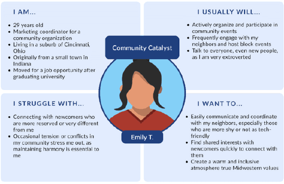
Persona development
Developed a primary and secondary persona using an empathy map/persona hybrid framework I created in order to keep us user-centered.
Process Part 2
We developed new product requirements through deriving use cases and prioritizing by impact and feasibility.
Process Part 2
We developed new product requirements through deriving use cases and prioritizing by impact and feasibility.
Quantified impact & feasibility with a prioritization matrix
We prioritized 34 potential features (derived from use cases) using a mapping activity with our team and client.
This matrix enabled us to us a data-driven approach to prioritizing which features we needed to focus on.
We prioritized 34 potential features (derived from use cases) using a mapping activity with our team and client.
This matrix enabled us to us a data-driven approach to prioritizing which features we needed to focus on.

Simplified complex design requirements into product "principles"
We created product requirement "principles" - synthesized "meta requirements" that were themes of specific features.
We then prioritized these using a MoSCoW framework utilizing the average impact of each principle's parts.
We created product requirement "principles" - synthesized "meta requirements" that were themes of specific features.
We then prioritized these using a MoSCoW framework utilizing the average impact of each principle's parts.
Product principles
Mo
Must Have
Data transparency & usage traceability
Data transparency & usage traceability
Always-available system status and error guidance
Always-available system status and error guidance
Common design patterns adapted for our users
Common design patterns adapted for our users
S
Should Have
Clear user flows and results of actions
Clear user flows and results of actions
Robust content tagging and categorization
Robust content tagging and categorization
Co
Could Have
Templates and suggested content for users
Templates and suggested content for users
Automated content imported from other sites
Automated content imported from other sites
W
Won't Have
In-depth customization of community-wide content
In-depth customization of community-wide content
Directly hosted resources or tools related to them
Directly hosted resources or tools related to them
Process Part 3
Our team ideated on features, defined the new information architecture, and created a "future site" user flow.
Process Part 3
Our team ideated on features, defined the new information architecture, and created a "future site" user flow.
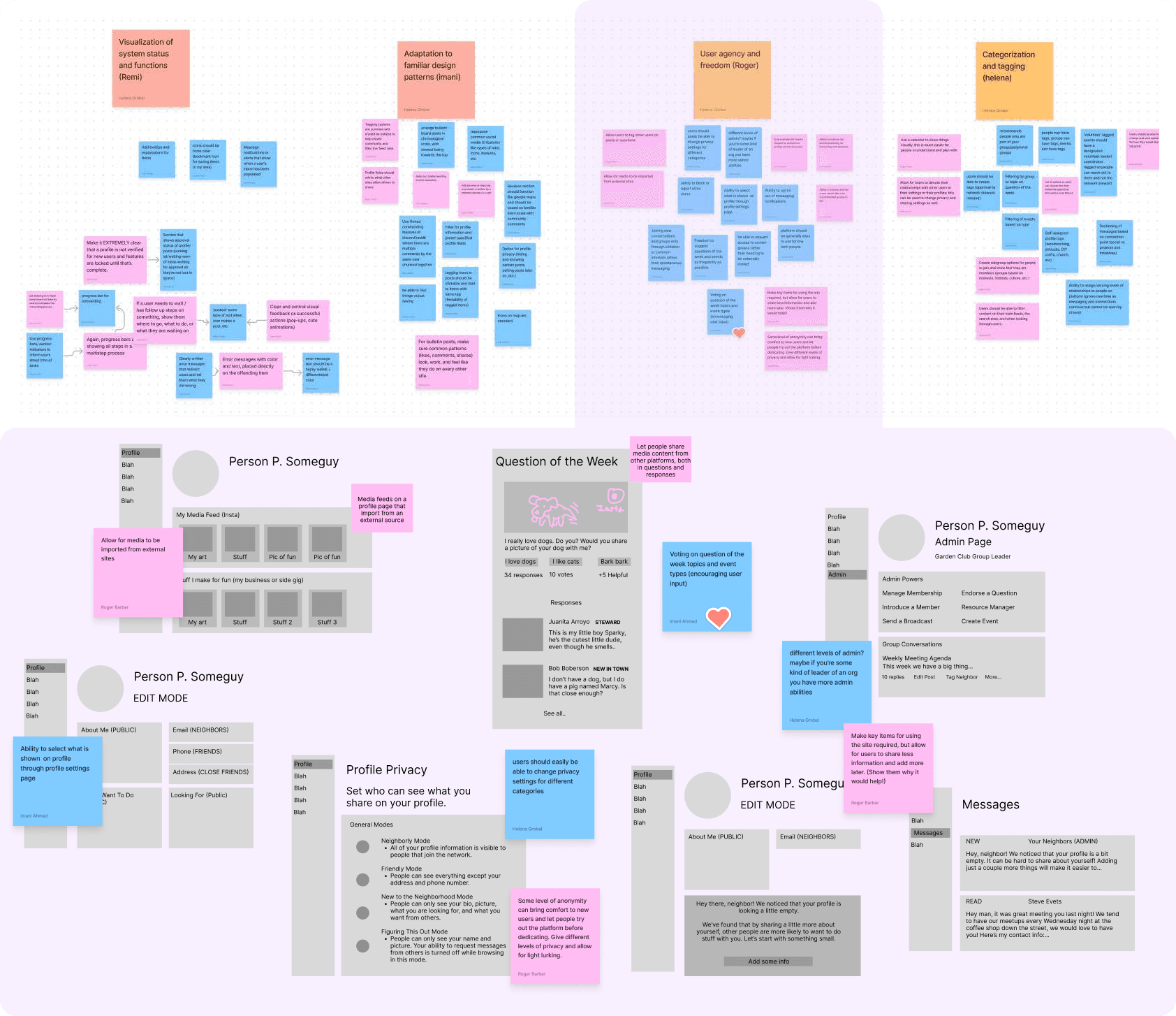
Workshopped principle-centric features for initial designs
I facilitated a workshop session where our team rapidly generated ideas for specific feature usage, going through each of our principles.
We then took these ideas and turned them into low-fidelity mockups in order to have meaningful feedback sessions.
I facilitated a workshop session where our team rapidly generated ideas for specific feature usage, going through each of our principles.
We then took these ideas and turned them into low-fidelity mockups in order to have meaningful feedback sessions.
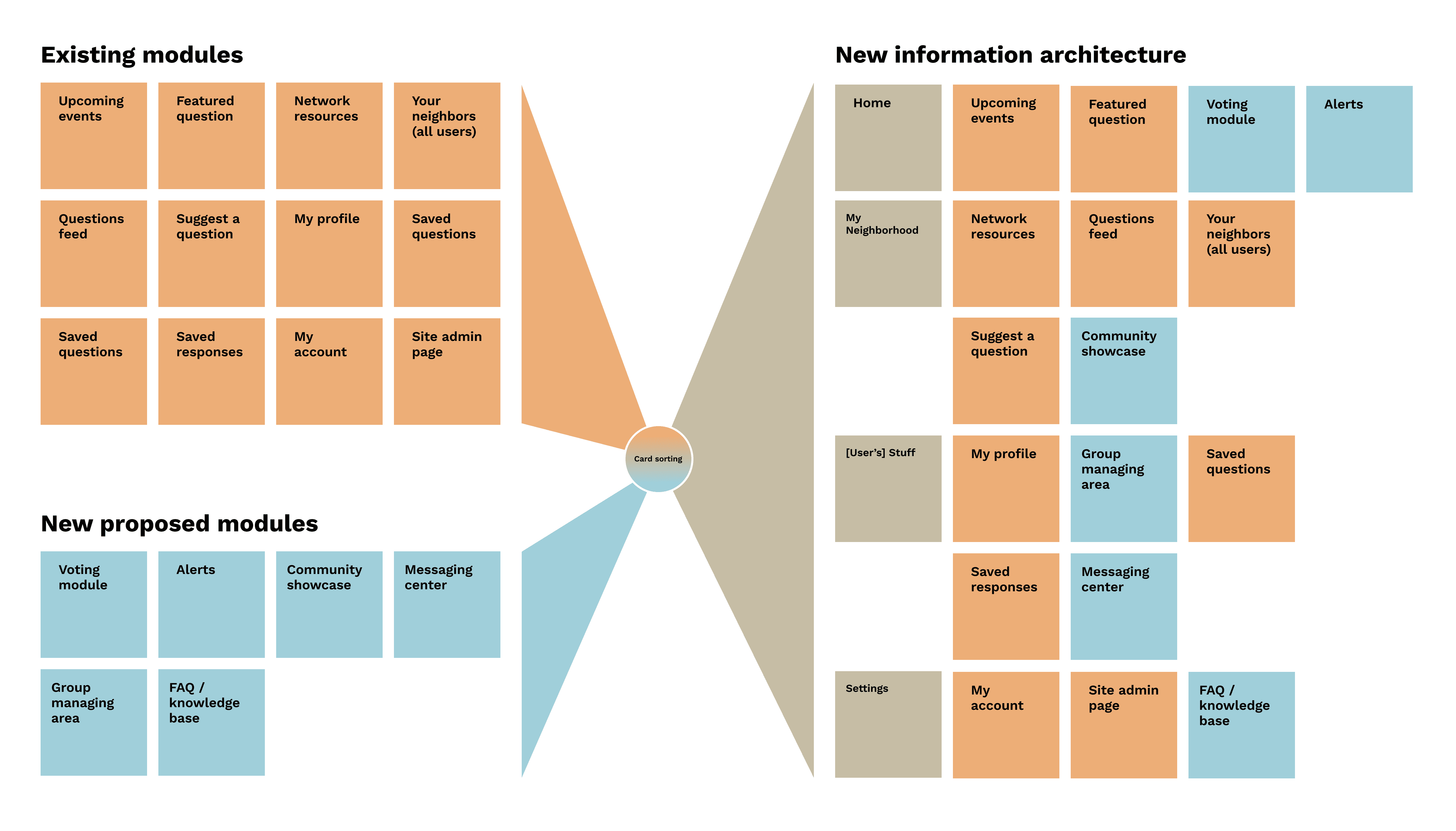
Redefined the information architecture using a card sort
We broke out every page and piece of the site into individual notes, and added in additional modules that we recognized as necessary from our research.
We then sorted these into "like categories" to get an initial, expanded information architecture in place.
We broke out every page and piece of the site into individual notes, and added in additional modules that we recognized as necessary from our research.
We then sorted these into "like categories" to get an initial, expanded information architecture in place.
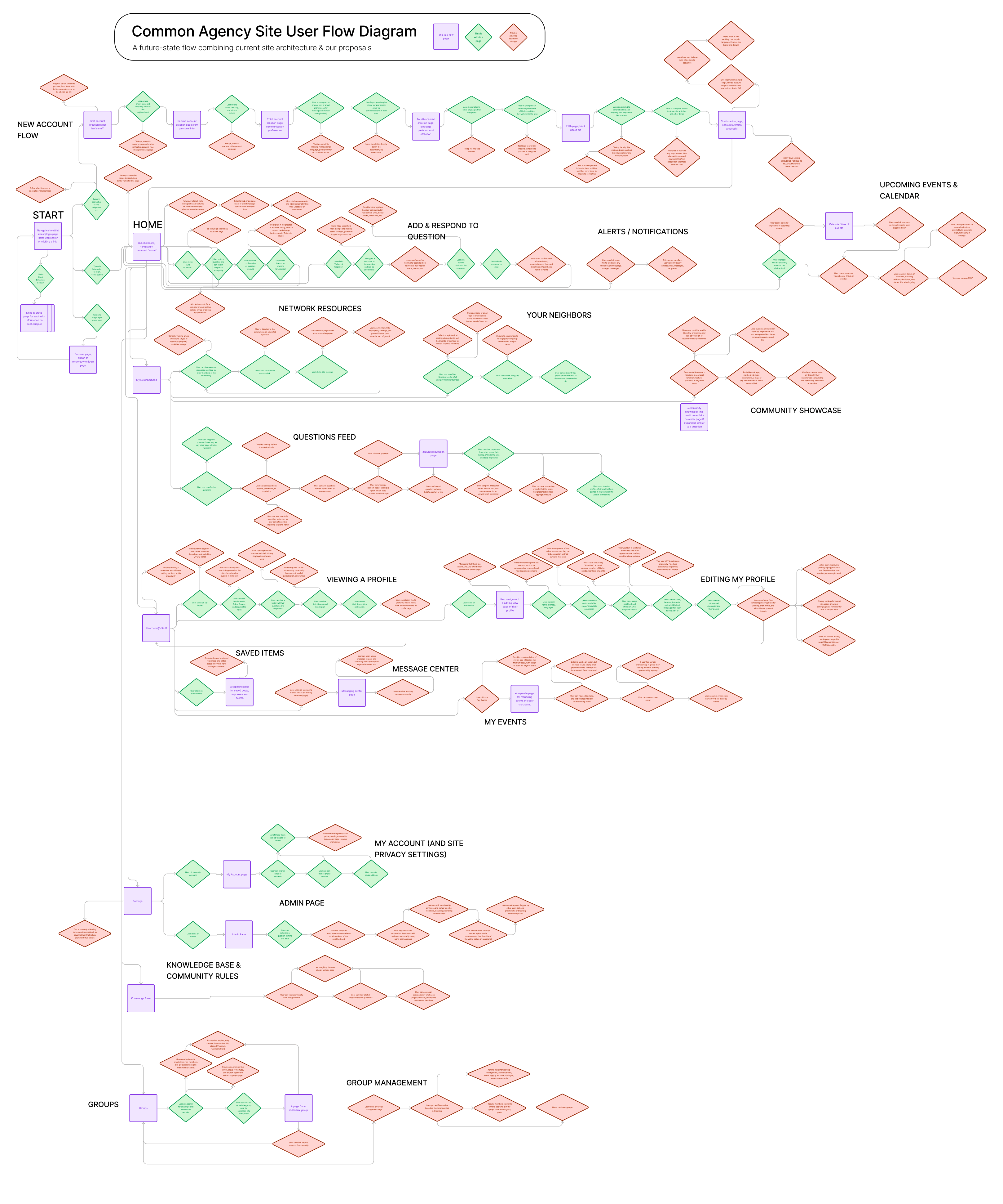
Mapped the improved user flow and product plan
The last step of the process was to completely map the high-level user flow. This process let us think through the site's structure through the eyes of someone using it.
My goal was to make a "go-to" design blueprint for our entire team, outlining:
Improvements and additions (red diamonds)
What pages exist (the blue squares)
Existing modules within pages (the green diamonds)
The high-level interaction design
An unplanned pivot
Our original architecture plan started didn't seem as logical after we began mapping out specific modules in detail.
We improved the flow by adding more top-level navigation items and "flattening" the structure, eliminating a number of problematic sub-pages.
Our original architecture plan started didn't seem as logical after we began mapping out specific modules in detail.
We improved the flow by adding more top-level navigation items and "flattening" the structure, eliminating a number of problematic sub-pages.
Process Part 4
We designed wireframes, iterated, and delivered an initial set of high-fidelity screens and a testable prototype.
Process Part 4
We designed wireframes, iterated, and delivered an initial set of high-fidelity screens and a testable prototype.
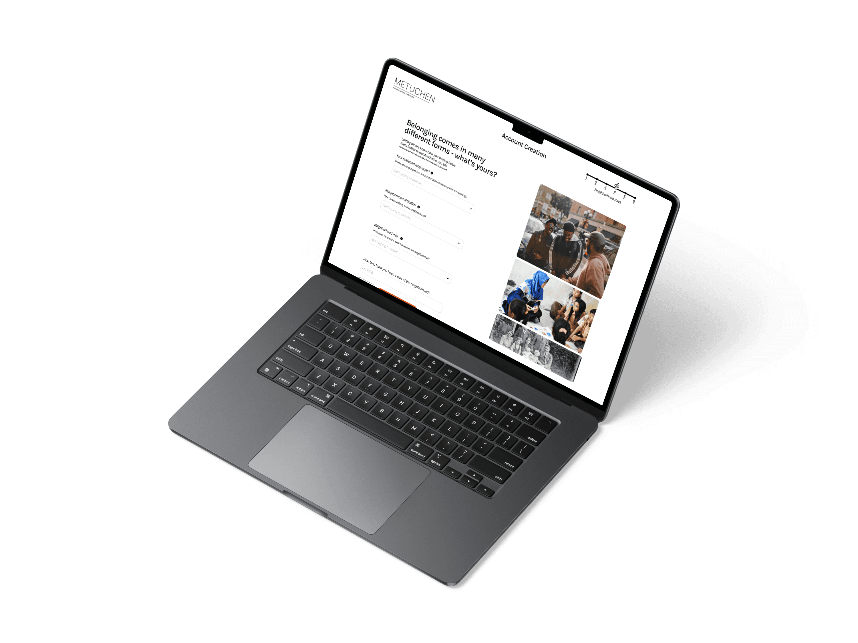
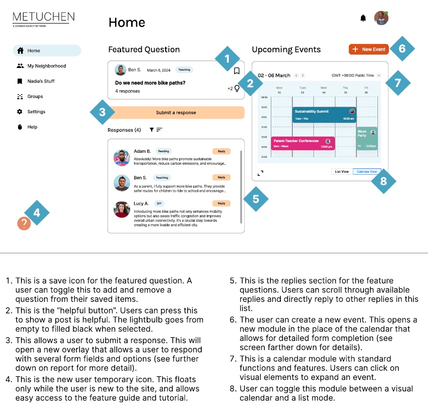
Tooled mid-fidelity wireframes for initial feedback & guidance
These blueprints were designed to elicit feedback from our client, peers, and provide the structural bones for all high-fidelity design and identity work. They are purposefully bare and minimum to focus more on structure and meaning.
We created the entire site; below are some examples of this stage of work.
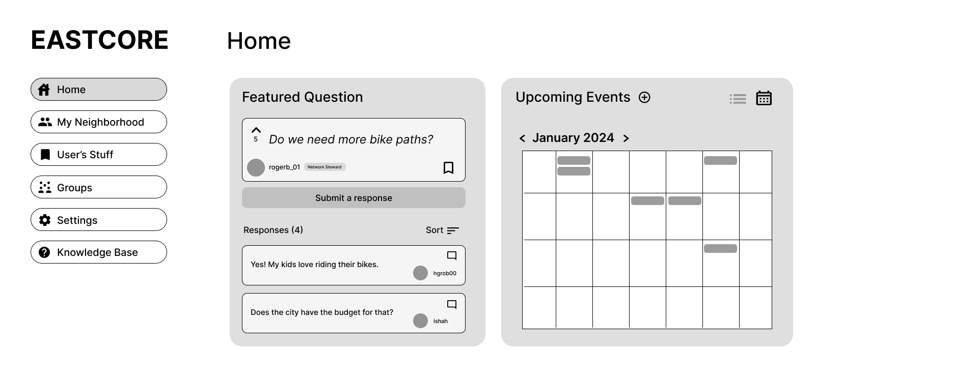
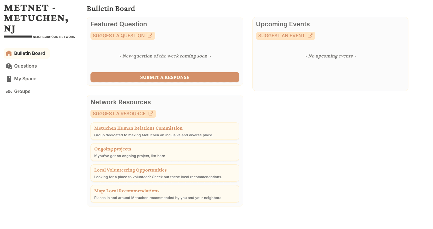
The new Home
The new Home

Explicit, transparent settings
Explicit, transparent settings
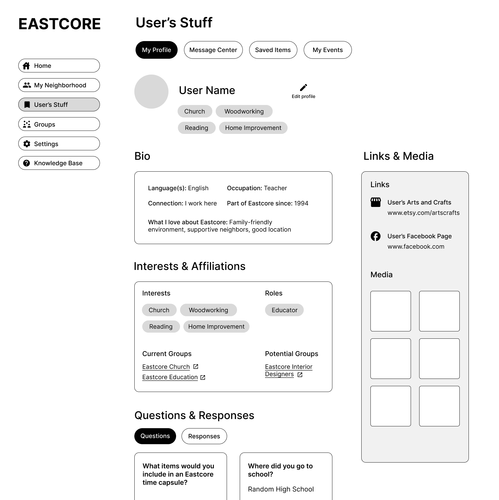
A person's "stuff" (their page)
A person's "stuff" (their page)
Realigned the brand identity to bring out the spirit of the product
We worked with the client to build sets of mood boards and compile key words that defined what Common Agency meant to the product owner.
We used our team's expertise to transform these abstract concepts into more usable, understandable, and powerful design artifacts.
We worked with the client to build sets of mood boards and compile key words that defined what Common Agency meant to the product owner.
We used our team's expertise to transform these abstract concepts into more usable, understandable, and powerful design artifacts.
Brand identity "key words"
Empowered
Witty
Warm
Grounded
Welcoming
Humane


Delivered initial high-fidelity prototype
Our team put together an initial, mostly-functional prototype with high fidelity screens. We would go on to use this prototype to elicit feedback from our client and our users.
Our team put together an initial, mostly-functional prototype with high fidelity screens. We would go on to use this prototype to elicit feedback from our client and our users.
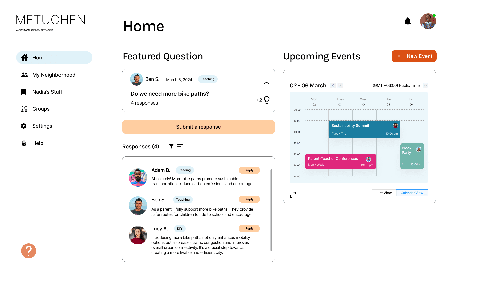
The new Home
The new Home
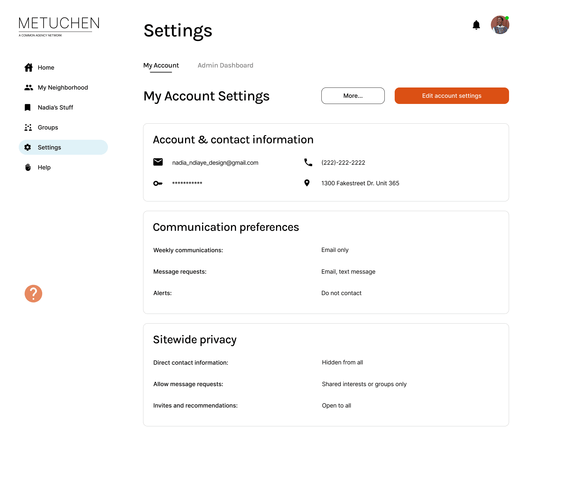
Explicit, transparent settings
Explicit, transparent settings
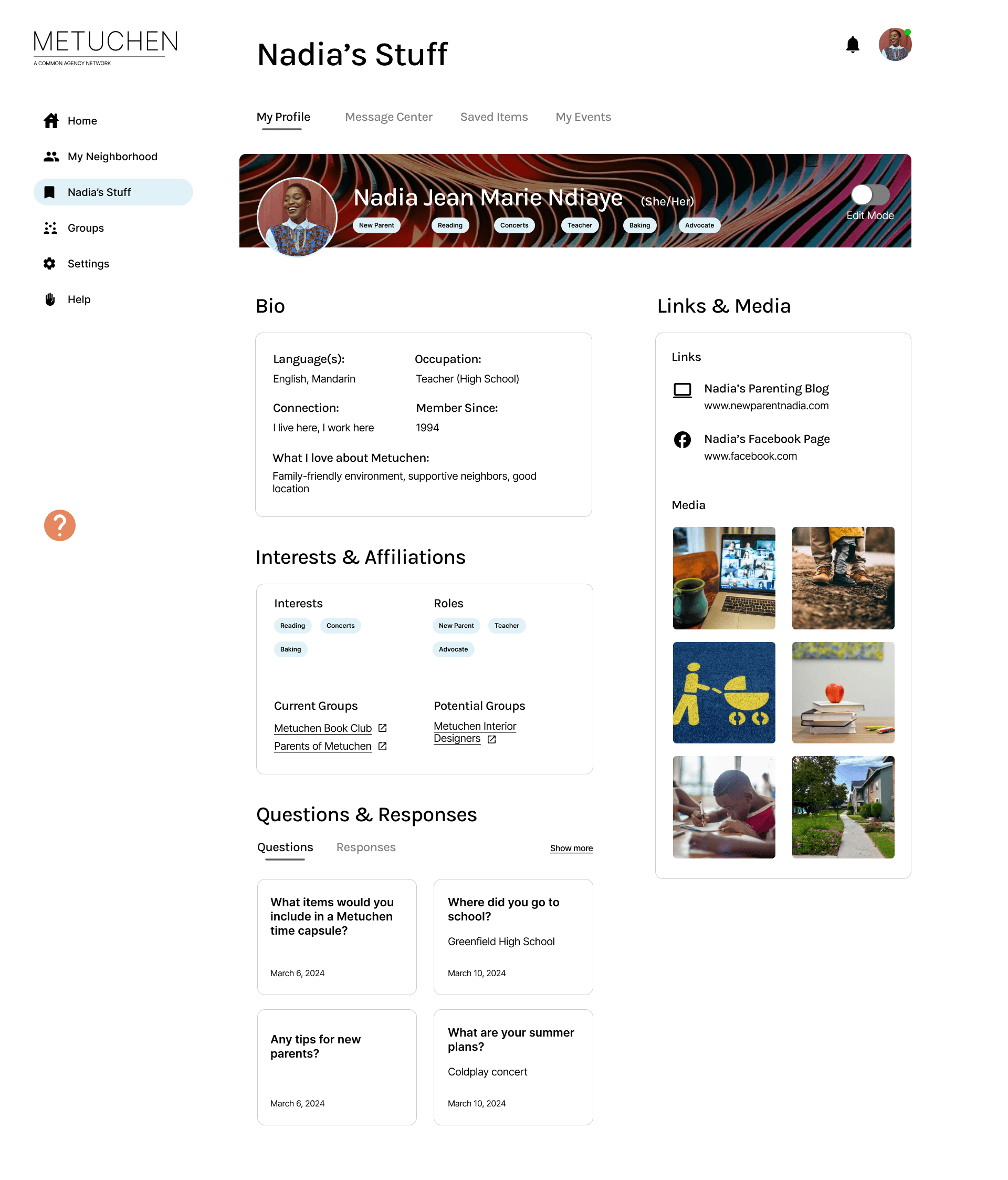
A person's "stuff" (their page)
A person's "stuff" (their page)
Process Part 5
We ran user testing to understand the efficacy of our designs and further improve the final product.
Process Part 5
We ran user testing to understand the efficacy of our designs and further improve the final product.
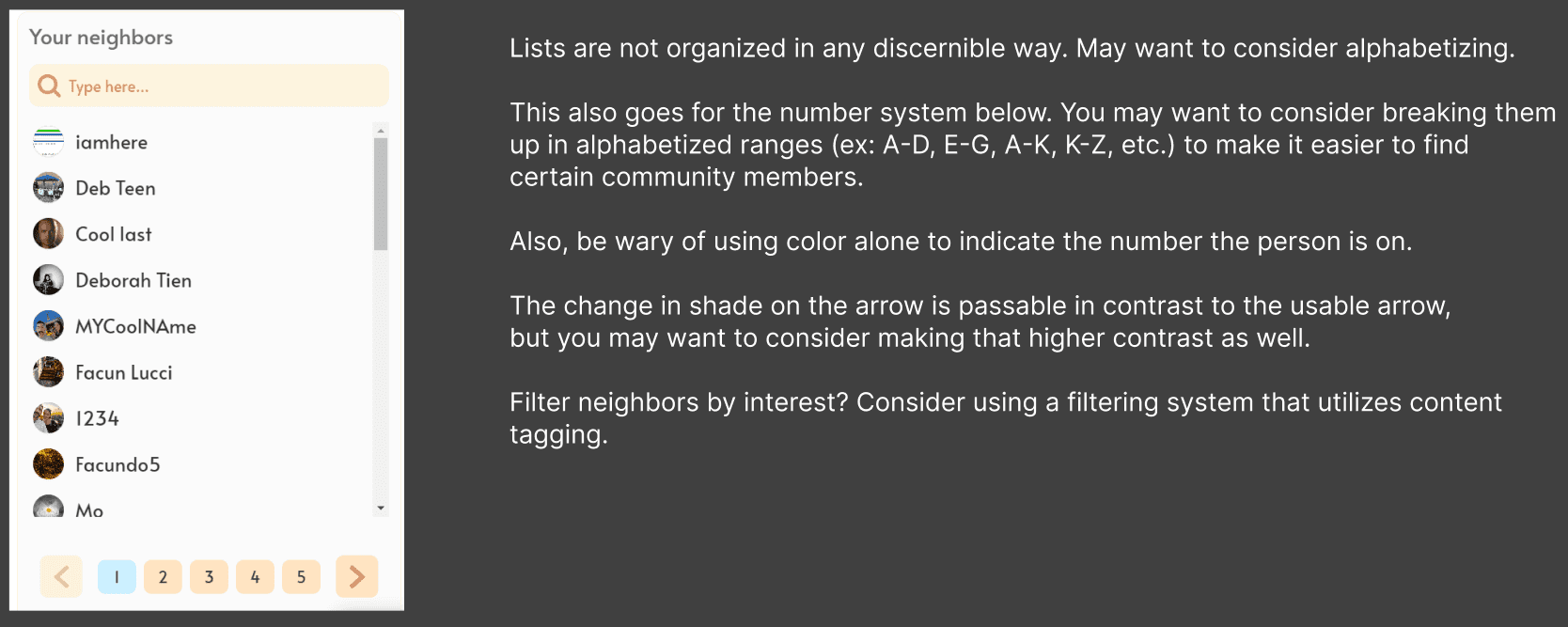
Ran task-centric usability testing utilizing a modified NASA-TLX scale
We recruited 8 participants to run through a task-centered protocol with clear but high-level instructions, such as: "I want you to find the tutorial for the home page and open it."
We monitored visible and audible frustration, hesitation, task completion times, and had participants debrief with a modified NASA-TLX scale which assessed digital task metrics only.

Conducted focused visual design interviews
We ran another 6 individuals through our designs, page by page, asking questions that assessed initial impressions of our visual design choices.
The goal was to understand user color, imagery, and info associations. Did our work quickly and effectively communicate both the functions and the spirit of Common Agency?
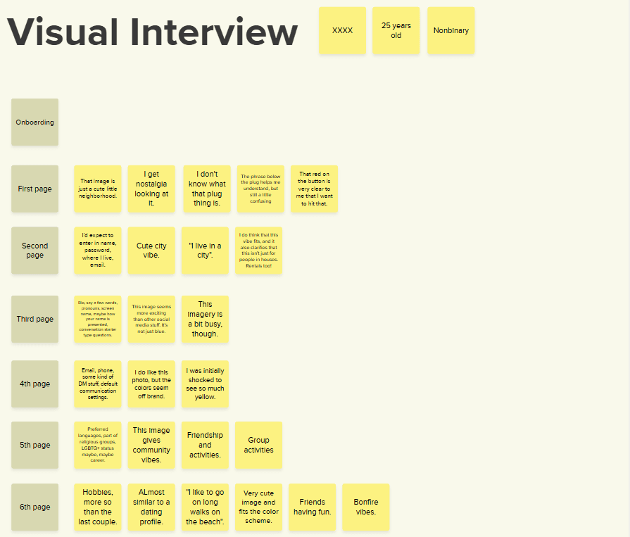
Derived 6 key takeaways to improve our design
We synthesized our findings after analyzing our results and came up with the following areas of improvement for our design:
We synthesized our findings after analyzing our results and came up with the following areas of improvement for our design:
1
Rely more on solely visual elements to transmit info and lower the density of information where possible
Rely more on solely visual elements to transmit info and lower the density of information where possible
2
Clearly label iconography, especially for non-standard use cases, and revise helper text to be more clear
Clearly label iconography, especially for non-standard use cases, and revise helper text to be more clear
3
More clearly differentiate actionable versus informational elements by utilizing similar hues across elements
More clearly differentiate actionable versus informational elements by utilizing similar hues across elements
4
Prioritize a guided onboarding experience as it reduced user frustration and mental effort by ~25%
Prioritize a guided onboarding experience as it reduced user frustration and mental effort by ~25%
5
Maintain the revised site architecture, as it maintained a <50% TLX in all scores for all users ("intuitive to use")
Maintain the revised site architecture, as it maintained a <50% TLX in all scores for all users ("intuitive to use")
6
Better utilize a combination of layout, position, and visual cues to guide user actions in order to lower cognitive load
Better utilize a combination of layout, position, and visual cues to guide user actions in order to lower cognitive load
Process Part 6
We delivered an improved final prototype and thorough handoff documentation addressing implementation & strategy.
Process Part 6
We delivered an improved final prototype and thorough handoff documents addressing implementation & strategy.
Key Decision 1
Transparent & guided onboarding
The original onboarding process:
Lacked system status indicators
Asked a lot of personal questions without explaining why
Unceremoniously dumped users into a non-standard home
Our improved version addressed this by:
Adding a progress bar and element-specific status indicators
Explaining "why" at every step and every page
Implemented a guided tutorial and omnipresent help button
Key Decision 2
Content transparency & customization
Users struggled to understand:
What certain content was
If content was relevant to them
How they relate to other users
What was visible to others
We addressed this by:
Adding a tagging system across all types of content
Converting critical information into tags automatically
Presenting in-depth content customization settings
Key Decision 3
Common design patterns & competitive features
Users found the old platform lacking in:
Features they loved to use on other social platforms
Ways of actually organizing groups of neighbors online
Ways to showcase what they care about and who they are
We refined the product by:
Adding more robust and intuitive event management and media options
Suggesting an in-depth and highly requested "Groups" suite of features
Adding several locations for individuals and neighborhoods to show off what they love
Handoff File Deliverables
Final Project Report
A synthesized, visually perfected artifact that condensed 150+ pages of insights and process into 40 pages of digestible information. This enables our client to thrive in future projects with a greater understanding of our "why" behind the designs.
A synthesized, visually perfected artifact that condensed 150+ pages of insights and process into 40 pages of digestible information. This enables our client to thrive in future projects with a greater understanding of our "why" behind the designs.
Annotated Wireframes
Every single page annotated with important interaction logic and outlining key design points that need to be translated into development. This helps ensure that developers have freedom to pursue what is feasible without losing key design elements.
Every single page annotated with important interaction logic and outlining key design points that need to be translated into development. This helps ensure that developers have freedom to pursue what is feasible without losing key design elements.
Finalized Site Map
A high-level overview of the structure and user flows for anyone utilizing the new Common Agency site. This deliverable helps the product owners visualize the overall page groupings and how the site as a whole fits together.
A high-level overview of the structure and user flows for anyone utilizing the new Common Agency site. This deliverable helps the product owners visualize the overall page groupings and how the site as a whole fits together.

Interactive Prototype + Design Files
Last - but not least - the interactive prototype and design files in Figma. These elements allow the product owner to showcase interactive elements and specific element sizing to developers, potential funders, and users.
Last - but not least - the interactive prototype and design files in Figma. These elements allow the product owner to showcase interactive elements and specific element sizing to developers, potential funders, and users.
Please view on tablet or larger breakpoint
This project was designed for desktop-sized applications only. To maintain the quality of the viewing experience, please view this project on a larger screen size.
Thank you for your understanding.
Key Learnings
We bit off more than we could chew in scope - and it cost us end quality
While we were able to complete the project, I truly wish we would have had the time to dive deeper into specific sections and improve the visual design.
We compromised on end quality in order to achieve the scope we had chosen. In the future, I will be sure to think about end quality more than ambitious scope.
User-friendly innovation starts with a spin on something people love
We were repeatedly shown that trying something drastically different - even if it's good on paper and supported by data - is often poorly received by users.
When we made tools that either related to real-life things people already enjoy or looked like apps they already use, they were much more willing to change.
Be inclusive, plan around your teammates' strengths, and communicate often
I took on a large portion of the work myself. As someone that wants to be a leader, I would go back in time and make sure that I am making space for everyone at the table.
No one is an expert at everything. It's the role of a leader to know how to bring out the best in everyone and help them grow.
Return to top
Return to top
Give that scrolling finger a break and click the button below to get back to the good stuff.
Return to top of page
Return to top of page
Designed, built, and maintained by Roger Barber (2025)